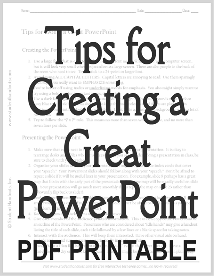
| Tips for Creating a Great PowerPoint |
|---|
| www.studenthandouts.com ↣ Miscellaneous ↣ Tips for Creating a Great PowerPoint |
|
Creating the PowerPoint 1. Use a large font that is easy to read. A 14-point font may look legible on your computer screen, but it will look very small when projected onto a large screen. There are also people in the back of the room who need to see. Try to stick to a 24-point or larger font. 2. Avoid using ALL CAPITAL LETTERS. Capital letters are annoying to read. Use them sparingly and only if you really want to EMPHASIZE something. 3.You're better off using italics or underlining words for emphasis. You also might simply want to try using bold font for important terms, dates, etc. 4. Use a dark font against a light background. White or light yellow backgrounds with black or navy blue text work best. You should also keep the "ink" color in mind if you are planning on printing PowerPoint handouts from your slides. Light fonts against dark backgrounds waste a lot of printer ink. 5. Try to follow the "7 x 7" rule. This means no more than seven words per line, and no more than seven lines per slide. |
 |
    |
|
Presenting the PowerPoint 1. Make sure that every seat in the room has a clear view of your presentation. It is okay to rearrange desks and tables when it is necessary. If you are a student doing a presentation in class, be sure to check with your teacher. 2. Organize your slides around your presentation. It might help to create index cards that cover your "speech." Your PowerPoint slides should follow along with your "speech." Don't be afraid to repeat a slide if it will be useful later in your presentation. For example, slide 8 perhaps has a great map that fits in with the early part of the presentation. The same map will be equally useful on slide 23. Your presentation will go much more smoothly if you repeat the map on slide 23 rather than awkwardly flip back to slide 8. 3. Look at your audience. You should not stare at the screen and read from the PowerPoint. If you are nervous, print a copy of your PowerPoint to hold. Don't be afraid to walk around as you speak (just don't accidentally block the screen). 4. Keep the lights on. Dark rooms make people drowsy. 5. Give each member of the audience printed information. This can be a copy of the PowerPoint or an outline of the PowerPoint. Presenters who are considered about "idle hands" may give a handout listing the title of each slide, each title followed by a few lines or a blank space for taking notes. 6. Interact with the audience. This will keep them interested. Have other visual aids on hand. Include review and survey questions periodically in the PowerPoint. 7. Always have a Plan B! The presentation "must go on" even if the power goes out. Have a whiteboard and dry erase markers on hand. Teachers might keep an alternative lesson plan ready. Click here to print "Tips for How to Do A PowerPoint Presentation." |
 |  |  |  |  |  |
| www.studenthandouts.com ↣ Miscellaneous ↣ Tips for Creating a Great PowerPoint |

