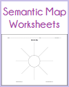
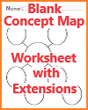
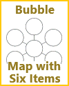
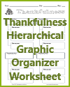
A hierarchical graphic organizer illustrates the organization and relationships between different levels of information or concepts in a structured and visual format. It is commonly used to depict a hierarchy or a system where there is a clear top-down or parent-child relationship among elements. Here's what is typically illustrated in a hierarchical graphic organizer:
Main Idea or Topic: At the top or center of the organizer, you'll find the main idea, central theme, or overarching topic. This represents the highest level of the hierarchy.
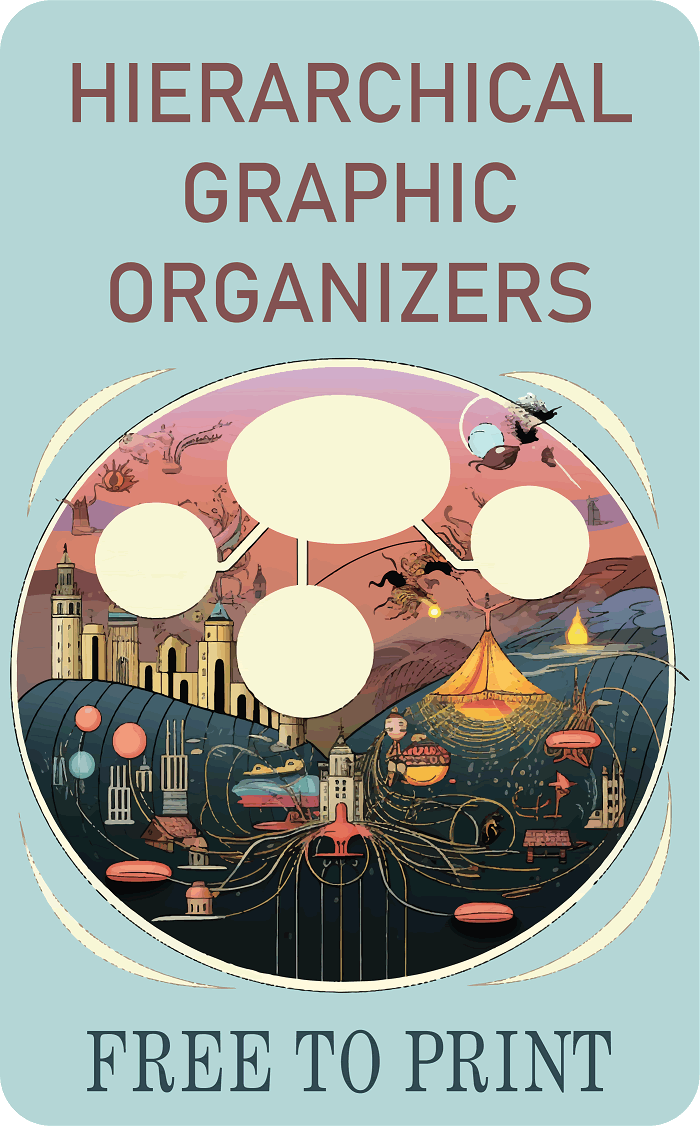 Subcategories or Subtopics: Below the main idea, you'll see subcategories or subtopics that are related to and support the main idea. These represent the next level of the hierarchy and can be further divided if necessary.
Details or Sub-elements: Under each subcategory or subtopic, there may be additional levels of information, details, or sub-elements. These are represented as branches or lines extending from the subcategories. These details provide more specific information related to the subcategories.
Relationships and Connections: Lines, arrows, or other visual cues are often used to show the relationships and connections between elements in the hierarchy. For example, lines connecting subcategories to the main idea indicate that they are subtopics or components of the main idea.
Emphasis on Importance: Hierarchy in the graphic organizer is often depicted through the placement and formatting of elements. The main idea or topic is usually at the top or center and may be in a larger font or bold text to emphasize its significance.
Visual Clarity: The graphic organizer is designed for visual clarity, making it easy for students or readers to see the structure of the information and how different elements are related. This includes using consistent formatting, alignment, and spacing.
Hierarchical graphic organizers are commonly used for various educational purposes, such as organizing information for research projects, outlining essays or reports, summarizing complex topics, and helping students understand the relationships between different concepts within a larger context. They are effective tools for promoting structured thinking, note-taking, and comprehension of hierarchical or layered information.
|
 Subcategories or Subtopics: Below the main idea, you'll see subcategories or subtopics that are related to and support the main idea. These represent the next level of the hierarchy and can be further divided if necessary.
